A few weeks ago I posted a list of vocabulary words related to Japanese calligraphy (described in Japanese as 書道 [shodou] or 習字 [shuuji]), and right around that time I began learning the enjoyable, yet challenging art form as a serious hobby. I’ve practiced almost every day, clocking up over 25 hours of working with pen, paper, and ink. If you include reading/watching study materials or interaction with other people on this topic, it’s closer to 30 hours.
Just to be clear, while I feel I have improved significantly during this time, by no means do I consider myself to be an expert. The characters I will show written by myself at the end of the article are not intended to be examples of superb calligraphy, but are rather to show what I was able to achieve so far. Likewise, I don’t intend this article to be a comprehensive, authoritative resource to learning shodou. My goal is to simply share some of the things I’ve learned along the way (some via explicit teaching, some via trial-and-error) and give a launching point for those who want to start learning calligraphy themselves.
Why Study Japanese Calligraphy?
Before I get into details I wanted to give a little background on why I have chosen to study shodou. As readers of this blog may have noticed I have deemphasized writing by hand in Japanese (especially for Kanji), which applies to both my personal studies and my recommendations to Japanese learners. This is because in my opinion there isn’t really much real-world use for handwritten Japanese with a pen or pencil, unless you are living in Japan (or perhaps working for a Japanese company). Even among natives, I have heard that the younger generation is getting less and less knowledgeable about writing Kanji since, after all, they can enter them in with a few motions on a mobile phone or desktop PC.
Having said that, in my earlier years of Japanese study I did give some emphasis to writing in Katakana and Hiragana––as well as writing a few hundred of the most basic kanji––but it is hard for me to keep that knowledge in my mind since I nearly never use it.
Putting the arguable uselessness of learning handwritten Japanese aside, I will say that being able to write Katakana, Hiragana, and some basic Kanji (with proper stroke direction and order) really helps you begin learning shodou with a running start, since you can focus more on the brush-related details as opposed to learning characters from scratch. Also, just being able to read Japanese (and having experience reading various fonts) gives you a good sense for how the characters should be written, and this helps with balance, one of the tricker areas to master.
As for why I felt it was worthwhile spending time to learn calligraphy, it’s because I thought that the end result would be far more rewarding than simply writing something with a pencil or pen, albeit far more difficult. I also thought that I might be able to use my calligraphy for this blog, as well as Twitter. Finally, learning calligraphy allows me to practice writing kanji in a more enjoyable (albeit time-consuming) way.
Nevertheless, I’d never imagined I would be this obsessed with Japanese calligraphy!
Calligraphy in Japan
There’s another reason learning calligraphy is beneficial––shodou is integrated tightly into Japan’s culture, and has been for quite some time. Japanese children are generally taught calligraphy as a required subject in early elementary school. One native-targeted textbook I have introduces basic brush strokes at the 2nd grade level in parallel with writing using a pencil.
Even for adults, shodou is treated pretty seriously in Japan and has kyuu- and dan- levels, similar to martial arts. Some people will even put calligraphy-related certifications on their resumes.
While you generally don’t have to read flowery calligraphy characters to understand most manga and novels, shodou is used commonly in daily life such as in advertisements and product marketing. For example, you often see it used on products such as sake, or on posters of restaurants or onsen (hot baths). Some Japanese fonts used in print and digital media are strongly based on calligraphic writing styles.
Basic Materials
The bear minimum required to start doing proper Japanese calligraphy is as follows:
- A brush designed for shodou(筆 [fude] is a general word for brush)
- Paper designed for shodou (半紙 [hanshi]). One side is slippery and one rough; you should draw on the slippery side.
- Calligraphy ink (墨汁 [bokujuu]). It can be black but there are other colors out there.
- A paperweight (文鎮 [bunchin]). You just want to make sure the paper doesn’t move, so any small, heavy object is fine.
- A place to put the ink while you are using it.
While most people who are learning calligraphy buy ink in liquid form, you can get an ink stick and grind it with an inkstone (硯 [suzuri]). I have done that, but it takes a long time to get the right level of darkness (a few minutes, if not more), and if the ink is too watery you will see dark areas where strokes cross and it will generally look odd. So while I recommend experimenting with grinding ink once you get to a more advanced level, for beginners I think it is not a good use of time. From what I’ve seen you don’t save that much money doing your own grinding either. (By the way, shodou professionals sometimes use a machine to do the grinding.)
For the place to put the ink, if you buy one of the typical inkstones it will have two sides, one for grinding (with a rougher texture) and one for simply holding pre-made ink. A word for the place you keep the ink when in use is 墨池 (bokuchi).
I bought my materials at Kinokuniya in Beaverton, Oregon, except for the paper which I bought online. Here is an example of a kit that has everything to get you started: https://www.amazon.com/Japanese-Calligraphy-Inkstone-Underlay-Paperweight/dp/B07N42QMGG/ref=sr_1_3?dchild=1&keywords=calligraphy+set+japanese&qid=1599604284&sr=8-3
Keep in mind that you will want to search for “Japanese calligraphy” (or Chinese), not typical western calligraphy, since the materials are different.
Before You Draw
The initial preparation is fairly simple. Take a single sheet of paper––make sure it is really a single sheet since they can be very thin––and put it on a flat surface, ideally on top of something that will not be damaged by the ink (it’s totally normal for ink to bleed through the paper a little). The set I linked above has an underlay (mat), though so far I have tried using a variety of things including a few sheets of random paper, cardboard, and newspapers. I recommend using newspapers if you don’t have a proper mat. I’ve heard you can use one or two layers of felt bought at a craft store, but I haven’t actually tried that yet.
Having a somewhat firm, but flat surface is *very* important. One problem with using other paper as a mat is that absorbing ink may cause it to warp, and this will ultimately affect the quality of your calligraphy.
Lightly shake the ink bottle (with the lid closed, of course), and then open the lid and pour the ink into whatever container you are using. Then immerse the brush in and spin it around to make sure it absorbs into all the fibers (including those on the inside). The brush should be soft, so if it is a new brush or one that has grown stiff make sure you bend it back and forth gently before you use it. Once you think you have enough ink throughout, then squeeze the brush against the inside of the ink container to get rid of some of the extra ink. The inkstone I mentioned earlier has a little nib that will help you to do this.
Both having not enough ink and too much will cause problems, but I would recommend erring on the side of too much at first. Over time you’ll learn exactly how much you want to achieve the desired quality.
By the way, I recently used up my first bottle of ink (a few hundred pages worth) and discovered what happens if you don’t shake the bottle––you end up with extra rich ink at the end. While I think there is actually some use for that type of ink, I would recommend shaking lightly before use just to get a consistent experience each time.
Next, place the paperweight on the top center of the page.
Posture is important when doing calligraphy; make sure you sit straight with a little space between your back and the chair (one textbook says the space of one fist), and your feet flat on the ground.
Cleanup
Before getting into the drawing itself, I wanted to talk briefly about cleanup. This is because I have struggled a lot with this myself and feel it is an area you should pay extra attention to. If nothing else, you’ll be able to save significant time by following good cleanup practices.
Calligraphy ink (sumi) can stain, and dries quickly, but can also be ‘reawakened’ (my term) when it gets wet again. Skin can also get stained easily and can take a long time to come off. These things make cleanup a bit messy.
The first thing I recommend is to make sure you actually cleanup when you are done drawing––don’t leave your brush or ink container sitting out between sessions, it will lead to caked ink and make things harder to clean later. If you still have a lot of ink left and don’t want to waste it, then it’s OK to leave it for an hour or two, but I wouldn’t leave it much longer than that.
It’s best to use up as much ink as possible before you finish drawing, as that will make it easier to clean up. Having said that, when you get down to only a little ink it will change the appearance of your letters (sometimes in undesirable ways), so once things start to look odd you can stop. It is possible to use a dropper to return unused ink to a more permanent container, and while I have tried that once it was pretty tedious, so I wouldn’t recommend it unless you are really on a tight budget.
You can scribble on some used paper to try and get some of the remaining ink off the brush. Then take something like newspaper or tissue and gently absorb some of the remaining ink in the brush. You’ll never get 100% this way (not even close), but it will make things easier later. Same thing with the ink container, use something to absorb the remaining ink, and make sure to get the inside edges to get as much as possible. You can get most of the container ink this way.
Next, clean the brush in a sink by running water over it, and try to keep the brush close to the bottom to avoid ink splattering too much. Ink will splatter, and even the part where there is running water can easily stain, so I recommend using foamy soap every few seconds during the process to remove stains before they get too baked in. Even if you get a stain, I think pretty much all sinks should be made with a material that can be easily cleaned when you are done. I’ve noticed that metal sinks seem to be more stain-resistant than white (porcelain?) ones.
Grab the hairs of the brush and gently bend them to get as much ink as possible out. You’ll find that even minutes later ink can mysteriously appear when washing at certain angles, but just a minute or so should be enough. When you are done, dry the base of the brush and make sure you form a clean point on the brush before hanging it to dry somewhere. You can also put it inside of the brush mat (筆巻 [fudemaki]), which are typically black, to dry. Don’t leave it to dry on any important paper since the water (and ink) will gradually get sucked out. Beware that even if the brush seems clean, touching it against any objects (especially while it is still wet) can transfer traces of ink.
After that, clean the ink container in the sink using a similar process, and you can dry the entire container with paper when you are done (whereas the hair part of the brush requires time to dry out).
During and after this process, check your hands to make sure they are free of ink. If you do find stains, the quicker you try to wash or scrub it off the better chances of success you’ll have.
Finally, if you accidentally get ink on a painted wall, do not try scrubbing off the paint with any degree of force. Let’s just say it leads to bad results. (:
From what I have seen, ink seems to wash out of clothes with regular detergent. But I haven’t tried this enough to guarantee it will work. If you are clumsy like me, roll back your sleeves when doing calligraphy (and wear dark colors).
Three Main Styles
Japanese calligraphy has three main styles:
- 楷書 (kaisho): Simple style where each stroke is separate and well-defined
- 行書 (gyousho): Semi-cursive style where strokes can be connected together and abbreviated.
- 草書 (sousho): Cursive style where strokes can be abstract and very distorted from their basic forms. (I consider this “freeform”.)
Each of these styles has its own rules and ways of drawing each character.
This page has a good example of each of these styles (plus two other styles which I have not mentioned here)
Generally you should start with the basic kaisho style and get very comfortable with that before moving on to more advanced styles, which is what I have done. For that reason, I will only be talking about kaisho in this article.
Choose a Consistent Style
Even within the strictest of the styles (kaisho), there is a lot of variation for how characters can be drawn. I have seen where children are taught simplified strokes, whereas for adults there will be more complex forms. Having said that, you will find many commonalities in the characters drawn by those formally trained in shodou.
Ultimately, I think a good calligrapher (書道家 [shodouka]) should be able to write characters in a variety of styles. But when starting out, it is best to try and learn a consistent style so your characters match well with one another. So whenever possible try to learn the style of one (or a small number) of calligraphers when you are a beginner. Eventually you will learn the typical way to do the most common strokes and be able to make adjustments yourself. I initially started by learning from a bunch of different sources, and am now starting to feel the difficulty of integrating all of them.
While there is a connection between some digital/printed fonts and calligraphic writing styles, for the most part I do not recommend using such fonts for reference since they can omit important nuances used in real brush-drawn characters.
Basic Brush Mechanics
There are several ways to hold the brush, but to start out I would suggest simply holding it like you would a pencil. Having said that, there are several important differences between when you write with a pencil. The first is that the angle of the brush should be much steeper, somewhat close to vertical, with a slight slant to the back-right. The angle of the brush is critical for proper form and because of habits from holding a pencil it is easy to lapse back into a lower angle without realizing it. You might consider videoing yourself or having someone watch, that way you can focus more on the brush angle.
The second difference from writing with a pencil is that your elbow should be off the table whenever you are drawing. Generally when you move the brush you want to move with your elbow whenever that is possible.
If you are right-handed, put your left hand on the bottom left corner of the paper to hold it in place, though you can adjust that for certain situations (like writing on the far right or bottom edges). If you are left-handed you can adjust accordingly. By the way, if you have some reference picture––usually a good idea––put that on your left side, it will be easier to see that way. (Again assuming you are drawing with your right hand.)
When you are drawing shodou, generally slower, with intention, is better as you can gauge exactly what you are doing, especially until you develop good habits. Certain strokes that seem like they require speed (like the “hane” and “sori”) can actually be done at a fairly slow pace.
To give you a better idea why it’s best to slow down, these are a few things you have to keep in mind and adjust in real time as you draw:
- The shape you are drawing
- Brush pressure (筆圧 [hitsuatsu]), and pressure direction
- Stroke thickness (related to pressure)
- Brush angle
- Angle of the tip of the brush to the base of the brush (this can change as the brush angle itself remains constant)
- The characteristics of the stroke you are drawing (thickness, etc.) compared to the other strokes in the current character
- The characters of the current character compared to the other characters on the page
It may seem a lot to worry about, but if you start with simple characters and take it slow, you can gradually learn what you need to, all while enjoying yourself.
After each stroke, you can put on a little more ink if you feel it is necessary, but as before make sure you squeeze out the extra ink. But what I’ve found to be even more important is making sure the shape of your brush is properly reset to a clean, pointed shape between strokes. You can shape your brush when you apply more ink, or just use the surface of the ink container to shape it without adding more ink.
As for the actual movements of the brush, a video (or in person) is the best way to show this. I am not doing videos for this article, but if people are interested maybe I can make a few eventually. In any case, for now I will just describe the basic movements for the simplest character: “一”(without the quotes), which stands for the number “1” and is a part of many other characters.
A Simple ”一”
Once you have enough ink on the brush (as discussed in the “before you draw” section), make sure the brush is held nearly vertically, with the tip pointing 45 degrees to the top left of the paper. This angle is critically important and all basic strokes begin with this angle. Touch the brush to the paper, making sure the tip of the brush points 45 degrees to the top left. Now slowly move the brush directly to the right until you have a longish line, then stop and pull up the brush carefully so you don’t make any extra marks.
Congratulations, you just drew your first character! This is a simple version of a 横画 (“yokokaku” or “yokkaku”) which means “horizontal stroke”. While it is recognizable, it lacks much of the finesse of a properly drawn “一”, which would have a few important differences: more definition to the beginning of the stroke, a slight upward tilt to the right, tapering in the middle of the stroke (the middle of the line is thinner than the edges), and a proper “finish” on the end to make a clean shape.
The Eight Basic Strokes
Japanese calligraphy has eight basic strokes, which are as follows:
- 横画 (yokokaku / yokkaku): horizontal stroke (ex: 一)
- 縦画 (tatekaku): vertical stroke (ex: the vertical part in 土)
- おれ (ore): a bend formed by a connected virtual and horizontal stroke. (ex: the top right stroke of 日)
- そり (sori): a stroke that begins downwards and quickly curves to one side in a diagonal fashion (ex: the bottom middle stroke of 心)
- 曲がり(magari): a stroke that curves more gently than おれ, but less than そり (ex: the bottom right stroke of 元)
- 左払い (hidari harai): a diagonal stroke (ex: the bottom left stroke of 木)
- 右払い (migi harai): a diagonal stroke to the right (ex: the bottom left stroke of 木)
- 点 (ten): a point (ex: the kanji 点 itself has four of them on the bottom)
While these are a good starting point and allow you to draw a bunch of kanji, there are many variations of these strokes and some strokes which would not cleanly fall under these categories. To give you an example, there are six types of points!
The Pursuit of Balance
Earlier in this article I referred to comparing one stroke with others in the same character, and one character with others on the same page. A more concise way to explain this is using the word “balance”, and achieving proper balance is one of the most important, and perhaps most difficult things in shodou.
Balance involves more than just drawing individual strokes and characters, it involves making sure they fit together in an aesthetically pleasing way. Looking at a character, or a set of characters, and saying it doesn’t look right is one thing––determining what is imbalanced and how to correct it is completely another. Sometimes a seemingly slight adjustment of stroke position, thickness, or length can have a huge difference in the overall balance of the result. That’s why learning to judge the balance of your characters, and thereby the balance of others’ characters, is a key skill to develop. One way to help train this is when you see a beautifully drawn piece of calligraphy, try and analyze its composition and how the different strokes work together to form a cohesive whole.
While a shodou expert can give you detailed feedback on the balance of your characters, the average native Japanese speaker should be able to point out obvious problems, so you can get quick feedback that way.
For those who already can write kanji properly with a pencil or pen you will already have learned about balance, which will make learning balance with a brush easier. However, some things like stroke thickness, which has a major effect on balance, will be completely new to you. (There are calligraphy pens where you can control stroke thickness to a certain extent, but I haven’t experimented with those yet.)
Self Taught Calligrapher?
So far on my calligraphic journey I have used a variety of resources: two calligraphy textbooks for early elementary children, advice from a few native speakers, web sites, and various Youtube videos. [Update: after writing this article I got a new textbook, but I will save the review of that for a separate article.] However, after hearing about a master calligrapher who offered to do a 1-hour lesson with me over the internet (for a fee), I decided to go for it.
While the main theme of this blog is learning Japanese self-taught, I will never claim that learning something without a teacher was the most effective method for everyone. Japanese calligraphy, like the Japanese language itself, has a great depth that can take many years to master.
While a portion of the hour-long lesson reminded me of some of the videos I had watched, I got a few pieces of feedback that were very valuable, and also asked some questions I had in the back of my mind. I did my lesson in Japanese, but this calligrapher (Emiko Kuisel) lives in the U.S. and is fluent in English, so she would be a good option for those who don’t know Japanese. I’m not sure if she is open to new students at this time but you can try contacting her via her website here.
I think there is nothing wrong with starting to practice shodou without a teacher who can directly interact with you, but I think most people will improve at a faster rate with at least occasional sessions of structured learning with a teacher.
I’ve mentioned one teacher here but I’m sure there are many other teachers out there who will give you online lessons if you look around.
How to Practice
Just like studying a foreign language, when one is learning calligraphy how you structure practice time is an important factor in determining success, as well as satisfaction. A teacher can give you suggestions, but ultimately you will need to make your own routine based on your personal schedule.
I would suggest starting choosing one of the simplest characters (一、二、川、人、木、土) and just try to draw it based on your intuition. Then find a video or other learning material that shows the exact movements and proportions of the strokes in question. Next you can try to emulate that and repeat it a few times, and eventually compare that to your first attempt (before you learned how to draw it properly) and see your improvement.
I try to balance my practice time between three main areas:
- Learning to draw characters I have never drawn before (at least one day but not more than two or three)
- Going back to characters I have learned previously and trying to review and refine them
- Picking a difficult stroke (for example “hidari barai”) and filling an entire page with many attempts of just that stroke.
One routine I developed recently involves drawing a character or two big enough to fit a single page. If that turns out to be a success, I would then take a photograph of it (and maybe put aside the paper). If it turned out to be a failure, I would use the space around the character(s) to draw smaller versions of the same characters, as well as practice problem stroke(s) of those characters. Then I would pull out a new sheet of paper, and repeat the entire process at least 4-5 times with the same character(s).
I used the words “success” and “failure”, but I would avoid being too strict with yourself, especially in the early stages of learning calligraphy. If you draw the character a little better than last time you can consider it a “success”.
When writing something like a fiction piece or an article, you may have noticed that if you come back to it a day later you realize things you missed when you originally wrote it. I have noticed the same thing with my calligraphy; sometimes when I look at what I wrote the next day I see things in a different light.
Final Thoughts
Learning proper technique and practicing diligently isn’t enough to make your Japanese calligraphy great; you need to have a calm, focused mind to do your best work. Because of how accurately your movements are transferred to the paper––like the nuances of a singer’s voice on a high-fidelity recording––losing focus for even the briefest of moments can ruin what would otherwise be a beautiful work of art.
Unless you are already skilled in some other related art, you probably will lack the sufficient fine motor skills when you first begin to practice calligraphy. As a result, you will find that you get inconsistent results; each time you draw a certain stroke, intending a certain shape, you end up with something slightly different. Being able to perform the desired stroke close enough to your goal a single time is one thing, but being able to do consistently will take much more time. I’ve experienced the same thing when learning Aikido. I think this is true for all the stroke types to a certain extent, but I have found “hidari barai” (the diagonal line to the bottom left) to be particularly hard to draw in a consistent way.
One other nice thing about shodou is that, unlike learning a language or a martial art, as long as you have the basic materials you can practice completely on your own. In times when we are seeing various restrictions regarding social interactions, this is a big plus.
But above anything else, Japanese calligraphy is a great way to challenge your mind and body, and success means a visual result that you can share with others or even make your own posters. I’m still at the beginning of my journey and that level of skill is far away, but for now I hope to enjoy my time with the trio of brush, paper, and ink, as I learn the fundamentals of this complex and rewarding artform.
If you happen to be into calligraphy (or decided to start as a result of reading this article), please send me a picture of one of your best works so far. I’d be glad to see everyone’s art! (email me at selftaughtjapanese [at] gmail.com)
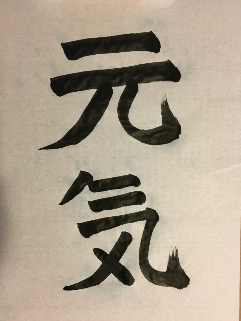
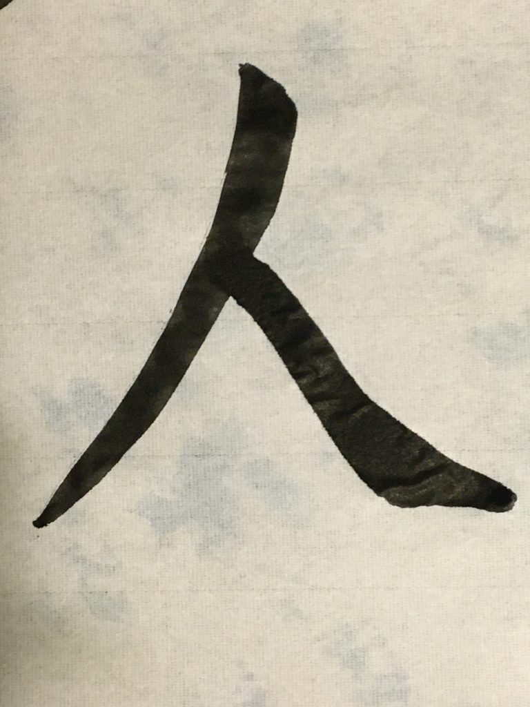
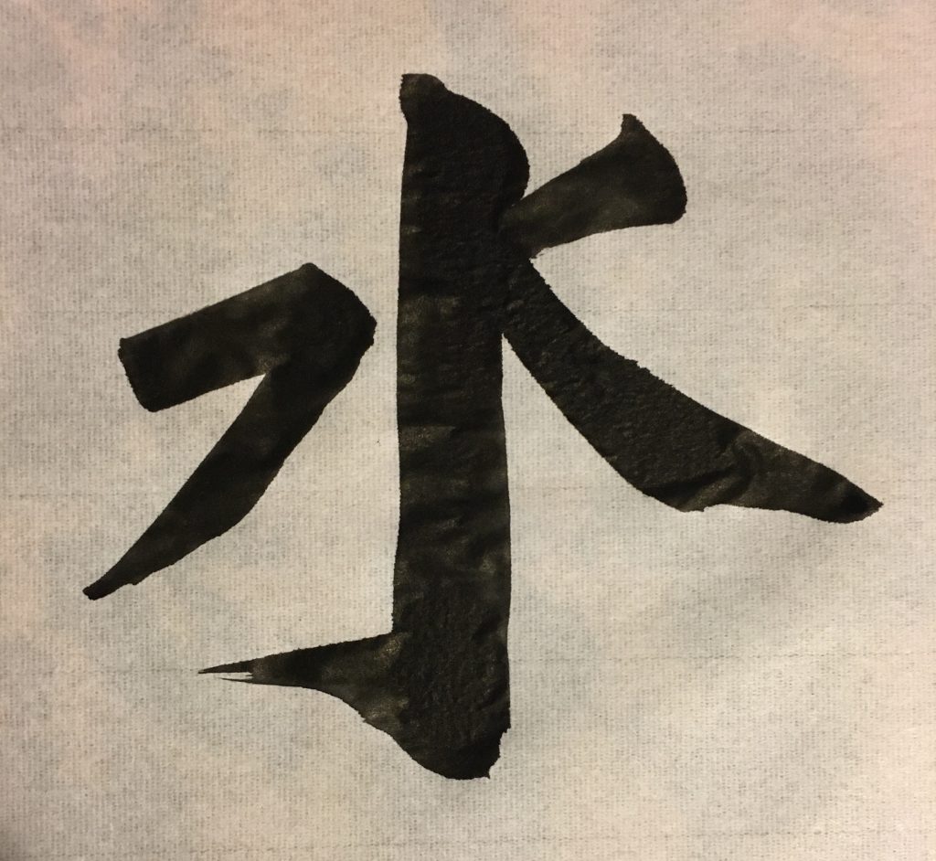
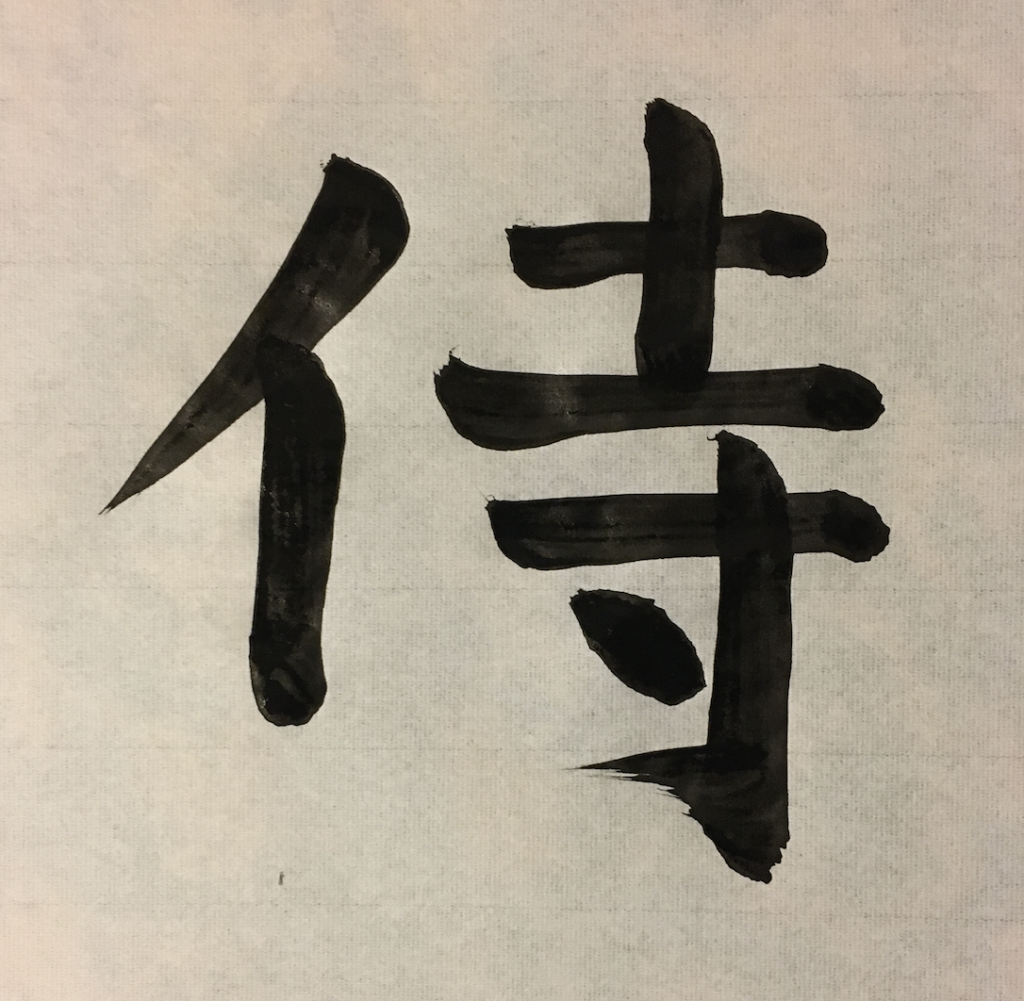
My Calligraphy
Here are a few of my recent drawings:
Youtube Links
This is a great video that shows some of the fundamental strokes. It’s in Japanese but even if you know no Japanese I think the visuals alone speak for themselves, and if you are learning Japanese this is a good way to get some extra listening practice.
This is the second video in the same series:
There are more videos in the series, but starting with the third one it switches to a special style (隷書, [reisho]) and for beginners I would recommend not watching those avoid confusion.
Thanks if you managed to read to the end of this long article (nearly 5k words!). Once I get some more experience I am hoping to write a few followup articles about Japanese calligraphy on this blog.
This is definitely one of those very in-depth entries that I click “like” on because a quick read of it proves it’s awesome but I know I really need to sit down and read through properly later because there’s so much there 🙂
I love the pictures!!!
I was just thinking the same thing a few minutes ago––the people that click ‘like’ may not necessarily actually read the whole article, but that’s OK. Just expressing interest is nice (:
Thanks for complimenting the pictures.
But I agree this article would take some time to read through it its entirety. It definitely took some time to write.
I read the entire article! Thank you for all the great info.