Recently I released the book “Classic Japanese Fairy Tales”, a set of English translations of several short stories by Mimei Ogawa, one of the founding authors of Japanese children’s literature. (You can find the original release post here, or direct Amazon link here)
In this post I’d like to give some information about how I made the book, which I hope is useful for those interested in the process or considering making their own Ebooks.
For my first two Ebooks I had leveraged Draft2Digital for some of the formatting and initial publishing, but due to complications I ended up switching to using Amazon directly. You can see a detailed report about how I made my first book here. Much of production flow for “Classic Japanese Fairy Tales” was the same, so in this article I’ll briefly summarize the similar points and spend more time on the differences.
Legal Permission
Mimei Ogawa’s stories are public domain in Japan, but that doesn’t mean they necessarily are classified that way in other countries. I already wrote a long post about this topic which you can see here. But the quick summary is I was able to contact the author’s grandson, Hideharu Ogawa (小川英晴), and get official permission to translate and publish these works.
Story Selection
As before, I relied heavily on voice narrations of the stories to facilitate story selection. Fortunately these were freely available on Youtube, and many of them were professionally produced with great performances, and in a few cases even music. Not surprisingly, a majority of the ones available in this format were the more popular stories, making selection even easier.
However, the popularity of a story wasn’t the only criteria I used for deciding which to translate. Except for “The Mermaid and the Red Candles”, I wanted only stories that had not been published in English before. Determining which stories had been published was not an easy task and involved a lot of internet research, plus the ordering of an old book from a distant library just so I could confirm the table of contents. I didn’t read many of English translations of Ogawa’s stories in full, but a few I did glance at were lacking, at least in my opinion. The only one whose English translation I read in full was “The Ox Woman,” which was done quite skillfully; you can find here in full. I looked at this more as a reference for style, since I knew I wasn’t going to use that story itself.
I also made sure that I really enjoyed each of the stories myself, for I wanted the process of translation to be as enjoyable as possible. Some of the more commonly well-known stories of Ogawa just didn’t suit me, or simply lacked enough emotional impact, so I skipped those.
Finally, I tried to choose a good balance of stories, including those that were––minor spoiler here––bittersweet (“The Golden Hoops”), touching (“Many Years Later”), dark (“Saffron Wine and the Desert Town”), or just plain adorable (“The Chocolate Candy Angel”).
Translation Workflow
The initial steps of my workflow were pretty similar to my previous two books: I used Google Docs and began with the original text of each story (taken from Aozora Bunko). Then I made an initial draft translation, going paragraph-by-paragraph, looking up words as needed and marking the trickier passages for further research.
Given these stories are nearly a century old, I ran into a few areas where I wanted to confirm my interpretation. Fortunately, acquittance Kaimai Mizuhiro was kind enough to assist me with this. No matter how well you think you know a foreign language, the help of a native speaker is invaluable.
Overall the translation was very challenging, but also a lot of fun. I am planning on making a separate article about the translation details so will omit that stuff here.
Bilingual Format
The more translations I do, the more frequently I find myself referring to the original text in later stages of the translation and editing. At some point I realized that there might even be some people wanting to read the original stories as Japanese reading practice, or even desire to perform a comparison between the English translation and original text in order to understand different translation possibilities (but by no means am I suggesting my translations are the ‘best’, something that is hard to define due to the subjective and stylistic aspects of translation).
I felt such readers were likely especially because many people would be discovering this book through my blog, which they probably came because they were studying Japanese.
Since I was only aiming for an Ebook for this first revision, I realized there was no disadvantage to having extra pages, like the added cost of printing physical pages for a paper book. So I decided to include all the stories in two different versions: an English-only version followed by a bilingual version where I interleave Japanese (taken from Aozora Bunko) and English paragraphs. I also made sure the table of contents links worked properly so users could easily jump to whichever set of stories they wanted.
It didn’t take me much extra time to include both versions, except in the final editing stage where I had to make changes in two places every time I made an adjustment to the English translation.
While there is no furigana on the Japanese text (I had heard of some issues displaying it on certain E-readers), I tested and was able to do quick lookups on Japanese words using the Kindle app on my iPad or iPhone. So while the ability to enable/disable furigana at will would be nice, I think the book is still useful as a study aid without that.
Ebook formatting
Although I relied on Draft2Digital’s template for my first two books, now that I was only using Amazon I didn’t want to rely on their template (although I had read that books made with their template could be used elsewhere). While their template had its own set of issues (including annoying compatibility problems with the drop caps), it was also quite convenient and gave a good overall visual result. So in a sense I had to start over and figure out how to do Ebook formatting with a different set of tools.
Although the most common paragraph formatting style for fiction books these days is to have per-paragraph indent with no spaces between paragraphs, I choose to do an alternate style: no indenting with spaces between paragraphs. Had I been doing an all-English book I might not have done this, but since a portion of the book was English mixed with Japanese I felt better with this formatting, which (while inefficient) I felt was easier to read, almost more textbook-like. If I ever make a paper version of this book I will revisit this decision, however.
The problem is that when you import a book into KDP (Kindle Direct Publishing) via a Word Doc file, it seems to automatically add paragraph indents when you actually view it on a device. I initiated a conversation with their support team, but since it was taking around a day for their response (and it would likely take several iterations back and forth), I decided to try and resolve it on my own.
Google Docs even allows export directly to EPub format, but unfortunately that exhibited the same problem with paragraph indents magically appearing.
I tried Amazon’s Kindle Create tool, which allows some basic formatting options, but unfortunately at present it is not possible to actually preview files made by this tool on actual devices (iPhone/iPad/Kindle reader, etc.). They can only be previewed on a software previewer. Because I had seen cases where the software previewer gave different results than an actual device, I found this drawback unacceptable and decided to try and find another option.
After much trial and error, I finally found a great tool to do E-book formatting: Apple’s Pages. This has a pretty good feature set, is relatively easy to use, and free. Oh, and luckily the mysterious indenting didn’t occur when I exported Epub from within Pages.
There was still some challenges to deal with, for example I had to remake the table of contents since it didn’t import from Google Docs. Pages has a feature to generate a table of contents, but that alone was not sufficient since I wanted the chapter names to be different from the actual first lines of text in each chapter. It went pretty smoothly once I figured out how to add and edit links myself.
The most annoying thing, however, was when certain things like formatting rendered quite differently after uploading to KDP. It took another process of trial and error to learn how certain styles and attributes rendered on KDP, and eventually I was able to get the content to look reasonable. Whereas for my other books I ended up tweaking HTML code in Sigil for final editing (tedious but relatively deterministic), Pages is, for the most part, a visual editor with an easier learning curve. (I also tried using Sigil but found it did not solve the indentation issue).
By the way, I didn’t have to do much special formatting for the Japanese text. I tried applying the same fonts and styles to it as the English text, and it came out looking pretty good. Had I used paragraph indentation I probably would have had to apply different style rules to the Japanese portions––a process that wouldn’t have been fun. There is a little bit of formatting on the Japanese paragraphs, for example line breaks in certain places, but those were carried over from the cut and paste from Aozora Bunko.
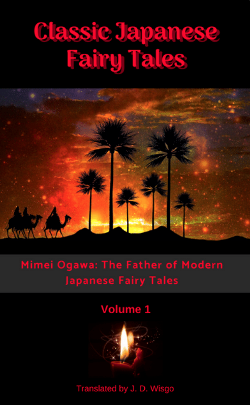
Cover
As with my other books, rather than pay for the cover art I decided to try and do it myself. I was set on using an impactful photograph from a free stock photo site and did my best to make a cover with Canva using a surreal desert picture I got from Pixabay. However, after getting some feedback on it, I decided to redesign it to be a little less ‘scary’. While I feel this first cover captured the feel of the “Saffron Wine and the Desert Town” story quite well, I was concerned that it might give potential readers a bad impression about the entire set of stories.
I ended up finding a nice template on Canva that gave a ‘classic’ feel and then added a diagonal red ribbon to highlight the fact it was a bilingual book. I definitely think the final cover looks more professional than the first one I made.
Final Proofreading
I did most of my final proofreading on real devices, including an iPhone and iPad, so I would see what the readers would actually see. While I had already gotten the text itself pretty refined before exporting out of Google Docs, during the final editing stage I ended up doing a bunch of little tweaks to refine things. For example, when comparing to another book on an iPhone I realized the em-dashes in my book were somehow half the normal size, so I ended up finding a longer version of the em-dash and using that instead of entering in the character manually on my keyboard. This gave a properly-sized em-dash which was much easier on the eyes. I also found one or two places where there was an extra blank page, and when I exposed hidden characters in Pages I saw there were a few characters that were causing this; deleting them quickly resolved the issue.
Besides different devices, I tried with both portrait and landscape orientations, and a few different font sizes. I considered buying the latest Kindle E-reader just to see the experience on that but decided to save the ~$200 this time. (If you find any formatting issues please let me know what device you were using)
Another thing I found only days before publishing is that the title I used when converting to EPub in Pages was actually being shown on the device itself. This surprised me since I thought the title came from the metadata directly provided to Amazon on the KDP pages.
Publishing
Once I exported an EPub file from Pages, publishing on KDP was as simple as uploading the file, the cover image, and filling in a few fields of metadata in Amazon. While there was still some time spent on experimentation and learning how to use Pages, overall I think I spent less time on formatting- and publishing-related matters in this book compared to my first two.
Pricing
The full story on exactly what percentage of the profit (royalties) you get on KDP books is a bit long, but the quick summary is that based on certain conditions you can generally get 35% or 70%. The latter 70% bracket requires that your price is at least $2.99, and for that very reason I decided to set that price for my first two books. I also felt the time effort I put into those two projects (as well as this one) made the books “worth” at least $2.99.
But for “Classic Japanese Fairy Tales”, I decided that selling more copies was more important than making a few extra dollars. So I got over the frustration of having to give away over half of my royalties to Amazon and set the price at $0.99 (at least for the time being), putting it in the 35% bracket.
Distribution Breakdown
While I didn’t record times spent for all my activities, I’d estimate spending roughly the following percentages on each of these categories:
- Story Selection: 15%
- Translation Draft: 25%
- Proofreading/Editing: 40%
- Formatting/Publishing: 15%
- Cover Design: 2%
- Other Content (introduction, acknowledgments): 3%
Thanks for reading this post! If you’re interested in taking a look at the book on Amazon you can see it here.
(This is what the original draft of a cover looked like. In an attempt to also represent “The Mermaid and the Red Candles”, at bottom I put a small picture of a red candle I found in free stock photos, but the flame is much bigger than the candle itself and as a result is not too effective.)